EXCITING NEWS!!
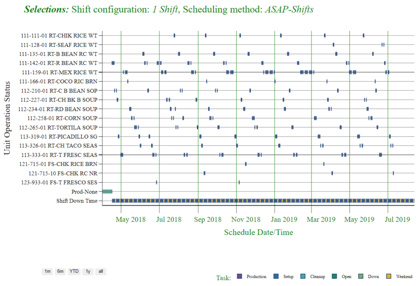
With one click of a button, the weekly production schedule (23 weeks) is converted to detailed capacity / labor constrained schedule. The program generates a Gantt chart and lists of the final detailed schedules for every product over the entire 23 weeks. The previous version of the software had the objective function of managing "quantities" of inventory and production. The new enhancement converts the quantities to capacity utilization time. Essentially the weekly schedule is converted to a finite capacity schedule, constrained by manufacturing equipment rates of individual products and labor shift staffing. Each product run has three elements: Setup time event, the production event and cleanup event. The finite schedule algorithms ensure that there is no overlap in any two events.
The user is provided the ability to choose a shift configuration and optional scheduling algorithms. The program will even recommend the best shift configuration, to ensure that all products / demand are made on time to meet the demand timing. For example, the aggregate of all setups, production time and cleanups may require a three shift configuration (24 hours per day and week-ends off). The available time with this configuration could cause an accelerated schedule to finish the 23 week demand ahead of what is required. However, if a 2-shift configuration is selected then customer service will suffer unless over-time is utilized to make up the time difference. The program will calculate that amount of over time required also.
Just as exciting, this new enhancement utilizes the very powerful Python programming language which is tightly integrated with Microsoft Excel. The enhancements take advantage of the best of all worlds - desktop (offline functionality); cloud-based ubiquitous access and communication of results; and back-end server power for very large datasets and processing. The built-in artificial intelligence is under the user's control. The HTML-based Gantt chart is very interactive with zooming and scrolling controls. Results are reported in a HTML-based table, written back into Excel as a table and appears on the Dashboard.